Humber Polytechnic is one of Canada’s leading post-secondary institutions, recognized for its commitment to innovation in education.
Within its many divisions, the Innovative Learning Department focuses on developing new educational tools for teachers and students. One of its latest projects is a space-themed educational escape room designed to immerse educators and learners in emerging technologies.
In 2024, I joined the team as a contractor to shape the project's visual identity, narrative, and interface creation.
How might we create an immersive, visual and interactive narrative that make students and teachers engage with a brand new educational space-themed escape room?

I began with a Kick-Off meeting with the Design Lead, who provided me with an overview of the needs, goals, and project scope.
Because the project brief was initially broad, I went through the project documentation, which included academic research on educational escape rooms, notes from previous meetings, and initial backstory idea.
🌱 This was a very unique project involving AI, coding, interior design, embroidery, and game design. I was given lots of freedom and independence. Shout out to my Rob, the Design Lead of this project, who trusted me throughout the process!

The team already had a general backstory inspired by Star Trek, but to fully visualize the escape room’s narrative, I needed to shape a defined spaceship mission. To do this, I collaborated with ChatGPT, transforming the initial concept into a story-line.
📜 Story overview: The Nebula Dawn is a spaceship on a mission to retrieve the Starheart—an artifact containing the secrets of the universe. However, the mission fails, leaving the ship lost in space.
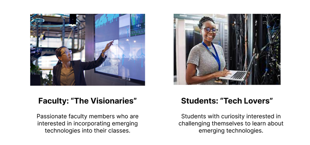
To keep the user at the center of the design process, I created straightforward personas. This made it easier to refer back to them whenever the project felt off track, ensuring that every decision remained user-focused.
Taking into account the user and educational escape room research, the branding strategy aimed to communicate that learning about emerging technologies is an engaging and fun experience.
By using simple and fresh fonts and colors, I sought to create a futuristic, friendly, and cross-generational branding.

To design the logo, I started using the Morphological Matrix, a tool that helps explore theme-related words and shapes to generate creative concepts.

After this, I created five logo iterations and selected two strongest options:

Between these two options, the team favored Option 5 for its simplicity and scalability. After iterating with multiple fonts, the final version was created. It symbolizes the Nebula Dawn spaceship approaching the Starheart.
I also updated the fonts on each physical interface, ensuring alignment with the chosen typeface and branding.

To align with the spaceship theme, I recommended using digital interfaces instead of physical ones to display hints and instructions.
As a Star Trek fan, I drew inspiration from the PADD (Personal Access Display Device), a handheld computer for accessing information. The team loved this idea since it was both budget- and developer-friendly, as we could easily replicate it using a fixed-sized tablet.
Following this futuristic narrative, the team also had in mind having a TV scoreboard to show where the player is in the game, and were also developing an Artificial Intelligence called Oracle activated by voice.

Example of tablet usage. AI generated image using Adobe Firefly
For the interface design, I re-imagined Star Trek’s User Interface. My approach began with transforming given information into initial branded screen designs. Here’s a sneak peek of the process:

Given Information

Initial Screen Design
After several iterations, here are some of the final designs.
TV Scoreboard 🖥️ (Where am I in the game?)
✨ This interface will be prominently displayed for players. Upon entering the escape room, they’ll see a captain's transmission, informing them that they’re lost in space and must repair the broken systems to return home.
Throughout the game, the interface will show the remaining life support time and a progress tracker for repaired systems.

Incoming Transmission

System Status
Interactive Tablet 📱 (How do I solve this game?)
✨ Players will access this tablet after the captain's instructions to view puzzle guidelines, follow the narrative in the Captain's Log, get hints for the Interstellar Map puzzle, and track life support time and system repairs.

Ship Systems Instructions
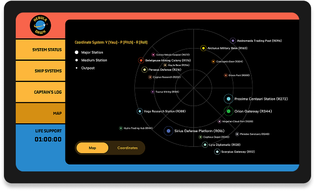
Interstellar Map
Voice User Interface 🤖 (Any hints to solve this game?)
✨ The team built Oracle, an AI that communicates via voice. Players can ask Oracle for advice during the game, and it will display a transcript of the conversation for better experience.

Oracle Transcript
After two months, I wrapped up the project. To streamline development, I documented design rules like color usage, font hierarchy, spacing, and layout.


I documented my process and final screens in a slide presentation, ensuring the project was accessible to multiple stakeholders.
The escape room is currently in development and testing. It is set to launch in the upcoming months 🚀 I’m excited to see my designs come to life and will share photos here in the future.

.png)